The category answer was a free month. Lifesum’s own data said a discount.
Lifesum’s invite screen gave nothing to either side, the weakest referral mechanic in a sweep of roughly 90 apps I ran. I designed a two-sided programme where the invited friend buys at a discount and the advocate earns a month only once that friend pays, so every reward is funded by the revenue that created it. The web half is live and selling inside its first week, on a partial rollout with no promotion behind it, while the in-app half waits on mobile engineering.
- Product
- Lifesum, a calorie and nutrition tracker. 65 million people, per Lifesum’s own public figure.
- Platforms
- iOS, Android, and a web landing page and checkout
- My role
- Sole designer. The competitive research, the model comparison, both flows, every screen, and all of the copy including the landing page.
- Team
- A PM, one web engineer and one mobile engineer. Marketing and CRM own the emails in the flow.
- Duration
- One month, from September 2026
- The constraint
- Very little mobile engineering capacity. It decided where the invited friend signs up, and which half of the programme shipped first.
- Outcome
- Live at lifesum.com/invite and selling within five days, on part of the Android audience and with no promotion. The in-app entry point is still waiting on mobile.
Outcome
What the programme offered before I started, and what it offers now
~90 apps
measured before a single screen was drawn
A Mobbin sweep across four domains, July 2026.
Nothing
what the old invite screen gave the advocate, and the friend
The weakest mechanic in that whole sample.
5 days
from the landing page going live to the sales the CRM team flagged
On part of the Android audience, with no promotion behind it and the in-app entry point still unbuilt. The figure itself is not mine to publish.
The brief
Growth asked me to make the referral programme more appealing
Lifesum already had a referral programme. Growth came to me with one sentence: we need to make our referral program more appealing.
It was a reasonable ask. Referral is the cheapest acquisition a subscription app has, the mechanic already existed, and making an existing offer more attractive reads like a pricing decision rather than a design problem. It is also the kind of brief that has already chosen its answer: turn the dial up, give more away.
The evidence
There was no offer to make more appealing. There was no offer.
Before touching the dial I measured it. I went through roughly 90 apps on Mobbin across four domains, health and fitness, fintech and banking, commerce and delivery, and subscription software, and read every reward amount off the screen copy itself.
Lifesum’s invite screen gave nothing to either side. No reward, no code, no tracking. Two mascots and a share button. It was the weakest mechanic in the entire sample, in a category where one month of Premium per converting friend is the ordinary baseline.
The people the programme was supposed to activate were already doing the work for free.
I have been using this app for 4 years and I love it. I’ve lost 150 pounds keeping track of my macros. I always recommend it to anyone on a weight loss journey.
Starting conditions
What the answer had to survive
- Mobile capacity
- Very little of it. This set the shape of everything: the web half could be built now, the in-app half had to wait, and it is still waiting.
- The paywall
- The onboarding paywall was the best performing paywall in the product. Nothing I designed could route around it or soften it.
- What a reward costs
- Every payout had to be funded by revenue the programme itself brought in, which rules out paying on installs or on signups.
The reframe
The question was not how generous to be. It was what the reward is made of.
Framed as
Our referral programme is not appealing enough, so make the offer better.
Reframed as
There is no offer at all, and the obvious one charges us twice. A free month for the invited friend is a free trial under another name, and a trial Lifesum had already tested converted worse.
In a subscription product the referral reward is paid out of revenue that has not arrived yet. Pay on installs and the programme loses money on people who never pay. Pay the friend in free Premium time and you have handed them the trial the data told you to avoid, at the exact moment they were deciding. Release the advocate’s month only once the friend’s paid subscription starts, and every payout is funded by the revenue that created it.
Exploration
Four reward models, and why three of them lose here
Equal reward, a month for a month
Both sides get free Premium time, and the advocate’s month unlocks when the friend’s paid subscription starts. This is the category standard: WHOOP, Tempo and Bonsai all run it.
This one died on Lifesum’s own numbers. A free month handed to someone deciding whether to pay is a trial by another name, and the trial that had been tested converted worse. It also makes the advocate wait a month to be paid, which weakens the reason to share again.
Invitee favoured, the friend gets the bigger push
Noom’s shape: two weeks free and 20% off for the friend, a gift card for you. The reasoning is that the friend is the one overcoming first-purchase friction, while the advocate is partly paid in social capital.
It does not fit here. The model is built for first-order businesses where a single purchase settles the relationship, and it leaves the advocate with no material reason to share at all.
Advocate favoured, nothing for the friend
The advocate earns a month, the friend gets the app and nothing else. No risk on our side, since a payout only ever follows a real subscription.
Nobody is motivated by it. With no offer to pass on, the advocate has nothing to show their friend, and the offer is the thing that gets shown. A weak friend offer makes the advocate look cheap.
The one I recommended: a discount in, a month out
The invited friend gets a discount on Premium through a unique link, usable once per account, at the normal onboarding paywall with no trial. The advocate earns one free month for every friend who actually subscribes: free users unlock Premium, paying members take it as billing credit.
What it gives up: the discount has to sit deeper than the best public promotion or it does not read as a favour from a friend, and that costs margin on every converting invite.
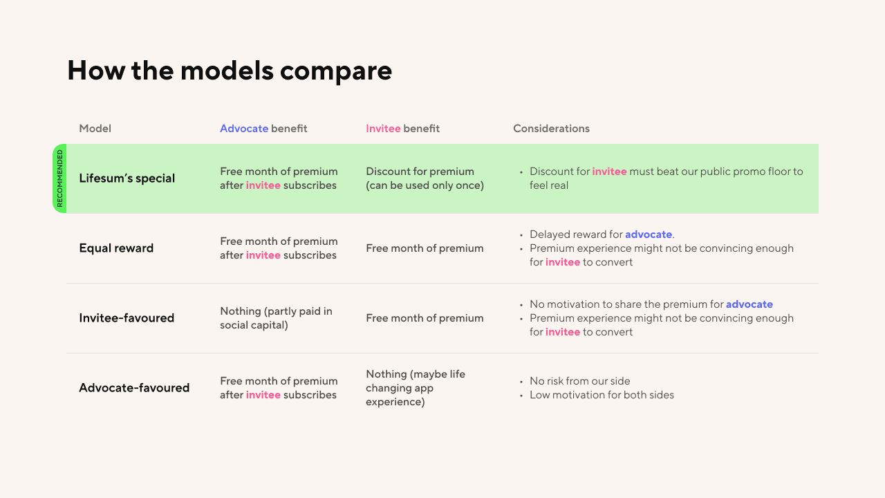
The slide the decision was made from. Every row carries what it gives both sides and the reason it does or does not fit, so the recommendation could be argued with instead of taken on trust.
Against my own research
My report recommended a guest pass. I argued against it.
In health and wellness the sweep was unambiguous, and gifting beats earning: Headspace, Fabulous and Rise all render the reward as an object you hand to someone, because recommending a health app reads as an act of care rather than a commission. My own report said exactly that, and it proposed a guest-pass shape for Lifesum.
I kept half of that recommendation and threw the other half out. The structure survived: a month to the advocate per converting friend, a cap, a progress tracker. The gift did not, because the gift is free Premium time, and free Premium time is the trial Lifesum’s data had already argued against.
That is why the programme does not look like its category. The friend is not handed a pass, the friend is sold a cheaper first year, and the paywall that already worked stays exactly where it was.
The system
Two flows, and a loop for the case where nothing happens
The advocate opens the invite screen from their profile, shares a unique link with a pre-filled message, and then waits. If the friend subscribes, the month is released and the profile updates with a new expiry date. If the friend does not, the advocate sees that no reward has landed yet, and is pointed back at inviting someone else.
That second branch is the common one. The reward only ever fires on a paid conversion, so most shares pay out nothing, and a programme whose usual outcome is invisible dies after one attempt.

The advocate side. The orange branch, no reward yet, is where most shares end, so it loops back to inviting instead of ending there.
Where the constraint landed
Mobile capacity decided where the friend signs up
I left one question open in the recommendation on purpose: where does registration complete, in the app or on the web? The first flow answered it the way the product would want. The friend taps the link, installs the app, goes through onboarding, and meets a discounted paywall in context, having already seen what they are buying.
That answer needed mobile engineering, which is the thing the team had least of. So the flow inverted. The friend now lands on a web page, creates an account, pays there, and only then downloads the app and logs in. It was the easier build, and it is the half that is live.
The friend now pays before they have used the product, and the handoff puts a download and a login between the money and the first meal they log.

What I recommended: the discount meets the friend inside onboarding, after they have seen the app.
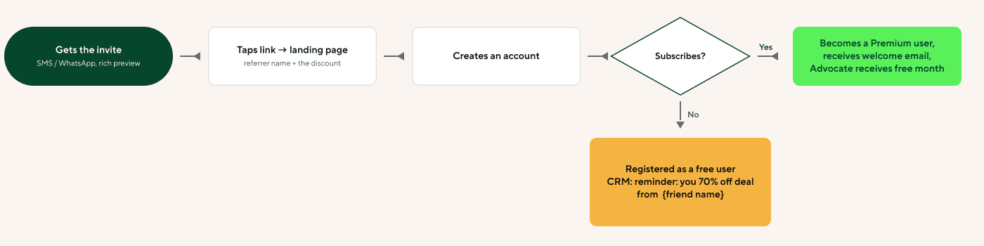
What got built, because it was the easier build. Registration and payment complete on the web, and the friend installs the app afterwards.
The design
An offer the advocate can see the state of
The invite sits in the profile, shares through the native sheet with Messages in front, confirms that it went, announces itself when it pays out, and then shows the advocate how much Premium they are holding and the date it runs out.
The advocate’s side, end to end
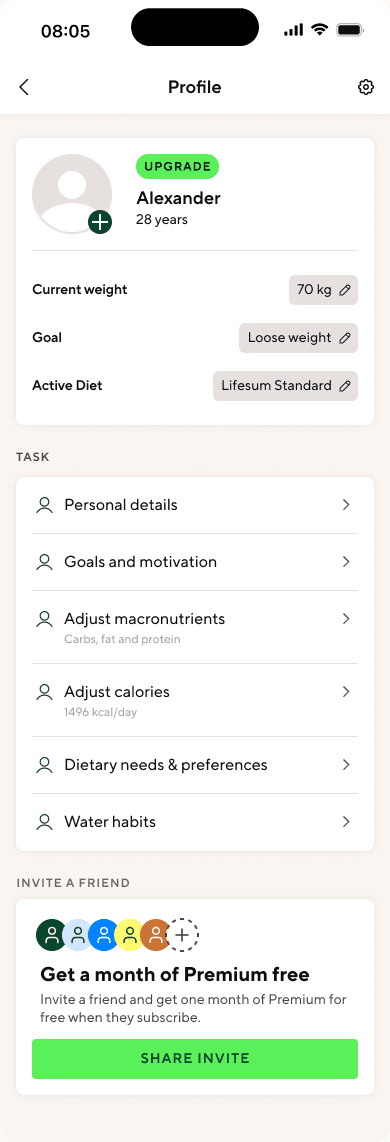
Before anyone is invited
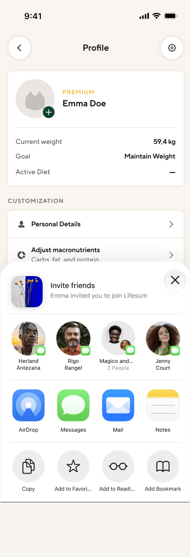
Native share, Messages first

The payout reports itself
Where the invite sits in the profile before anyone has been asked, the share itself, and the push that reports a payout. What the card does after that is below.
The states are the design
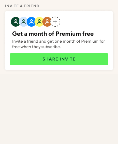
Empty
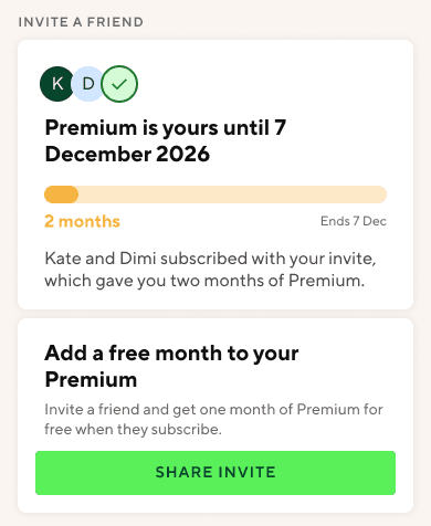
Earned
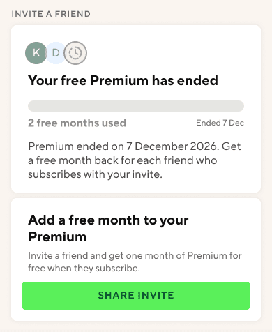
Ended
The same section, before any invite, after two friends subscribe, and once the earned months run out.
The states are the design
One card, three jobs
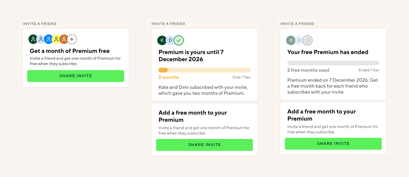
Before anyone is invited
Placeholder avatars ending in a dashed add button, under the headline Get a month of Premium free.
The avatars are an affordance, not data. The row says this is a thing with people in it before there are any, and it is the slot the real faces drop into later.
After two friends subscribe
The headline becomes Premium is yours until 7 December 2026. An amber bar fills to two months, the faces turn into initials with a tick, and a line underneath reads: Kate and Dimi subscribed with your invite, which gave you two months of Premium.
It names the friends instead of counting them, and it leads with the date the Premium runs out rather than the months banked. The advocate is holding something with an end on it.
When the months run out
The bar greys out, the tick becomes a clock, and the headline reads Your free Premium has ended, followed by: Get a free month back for each friend who subscribes with your invite.
The expiry doubles as the next prompt. The same card that reports the loss carries the way to undo it, and the offer to invite again sits under all three states unchanged.
Key decisions
What each choice is paying for
The friend gets a discount, not free time
A straight discounted price at the normal onboarding paywall, usable once per account, with no trial attached.
This is the decision the whole model rests on. Free Premium time would have put a trial in front of someone at the moment they decide, which is the route Lifesum’s own testing argued against.
The reward waits for a paid subscription
The advocate’s month is held until the invited friend’s paid subscription actually starts.
It makes the programme self-funding, and it makes fraud expensive: gaming it requires somebody to really pay.
The discount points at the annual plan, and sits below the public promotion
Annual rather than monthly, and deeper than the best discount already advertised publicly.
Annual protects the margin the advocate’s free month costs. Going below the public floor is what makes the offer read as a favour from a friend rather than the banner everyone can already see.
A paying member is paid in billing credit
Free advocates unlock Premium. Advocates who already pay get a month of billing credit instead.
The same reward cannot arrive the same way for both: a free month is worth nothing to someone who already has Premium, so for them it has to arrive as money.
SMS first, with the message already written
The share sheet opens with Messages in front and a pre-filled note, not a link to broadcast.
Health referrals in the sweep travel one to one, not to an audience. Noom writes the testimonial for the sharer for the same reason.
The profile shows a balance and an expiry date
Once invites convert, the card becomes a count, a new expiry date, and a progress bar running toward it.
Every mature programme in the sweep had somewhere to see what was pending and what had been earned.
The invited friend
What arrives, and what it opens
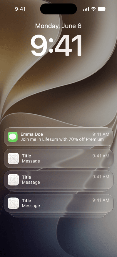
Arrives as a message
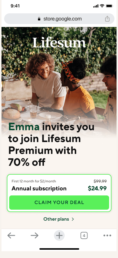
The sender’s name and the price
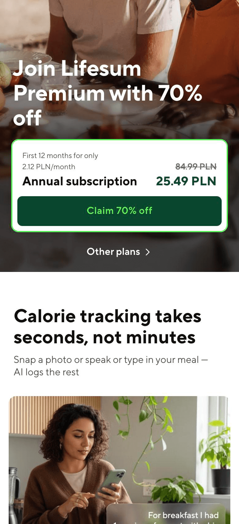
The offer, as it shipped
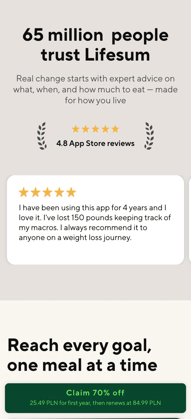
The proof the page leans on
What the friend is buying
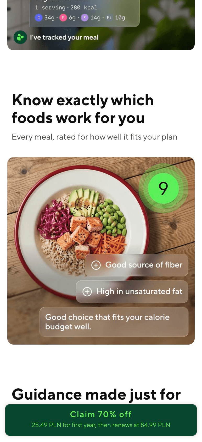
The invite as it lands, the personalised landing page carrying the sender’s name, then the page as it is live now: the offer, the proof it leans on, and what the friend is actually buying. The review on the proof screen is the one quoted earlier, chosen for this page because the person writing it was already recommending Lifesum without being asked.
Validation
What this was tested against, and what it was not
Not users. In one month, with the in-app half unbuilt, there was no version of this a person could be put in front of, and I am not going to describe a competitive sweep as usability testing.
What it was argued against: roughly 90 apps with their reward amounts read off the screen, Lifesum’s own evidence about how a trial performs here, and four models compared in writing with a stated reason for rejecting each. The recommendation went out with its open questions attached, not hidden: how deep the discount should go, whether to cap the number of invites per advocate, and where registration completes.
First signal
It started selling before the in-app half existed
Five days after the landing page went live, on part of the Android audience and with no promotion behind it, the CRM team flagged the sales number in Slack. The figure is not mine to publish, only the reaction to it.
The conditions are what make it worth reporting. This is the web half on its own: a partial rollout, no campaign, and no invite entry point inside the app, which is the surface the whole programme is meant to run on.
wow that’s a lot for basically 0 promotion
The risk I named
What I told them to watch, since I could not watch it myself
- The weak point
- The advocate is only paid when the friend subscribes, so each share pays out rarely. The ordinary experience of this programme is inviting someone and getting nothing.
- Watch first
- Advocate sharing volume, and specifically whether people invite a second time after the first invite pays nothing.
- Watch second
- First-renewal retention on discounted subscriptions, for churn the discount bought rather than earned.
- Still not measurable
- Both of those need the full rollout and a renewal cycle. What exists so far is five days of sales on a partial launch, which says the offer works and says nothing yet about what it costs.
Looking back
The entry point is in the quietest place in the app
My own research said to put the invite where the wish for a discount or the feeling of pride already exists: a goal reached, a streak, a paywall someone has just dismissed. What shipped is a card in the profile, which is about the coldest surface available.
That was a deliberate trade rather than an oversight. The better journey needed mobile work the team did not have, and a card in the profile could be built now. It is still the first thing I would change.
My role
Who did what
- Me
- Sole designer. The Mobbin sweep, the four-model comparison, the recommendation and its open questions, both flows, every screen, and all of the copy including the landing page.
- Product
- A PM on the project.
- Engineering
- Two engineers, one web and one mobile. The web half is built and live; the mobile half is queued behind the capacity that shaped the whole design.
- Marketing and CRM
- They own the emails in the flow, the welcome message and the reminder to a friend who registered without paying. I specified where those messages sit and what each one has to do.
- Research
- No researcher and no user research. The competitive sweep was mine, and it is the only research this case study claims.
- What outlived the project
- Nothing. No pattern, document or ritual stayed behind from this one, and the research report is the only artefact that would survive on its own.